
WSS RETAIL BRANDING SYSTEM
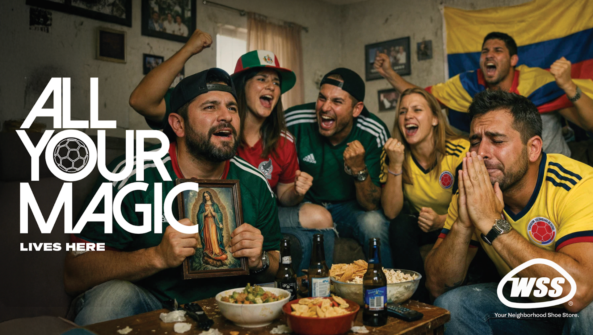
For this community, fútbol was never a trend. It was already there. In the neighborhood, in the living room, in the jersey that hasn't moved from the back of the chair since the last game. WSS understood that. The challenge wasn't to celebrate the World Cup. It was to make the community feel that the World Cup was celebrating them back.
The brand needed to own the moment without borrowing it. No FIFA marks, no official anything, is and just the same energy, the same chromatic explosion, the same sense of something enormous about to happen. That meant building a visual system from scratch that could live inside the World Cup zeitgeist while being entirely and unmistakably WSS.
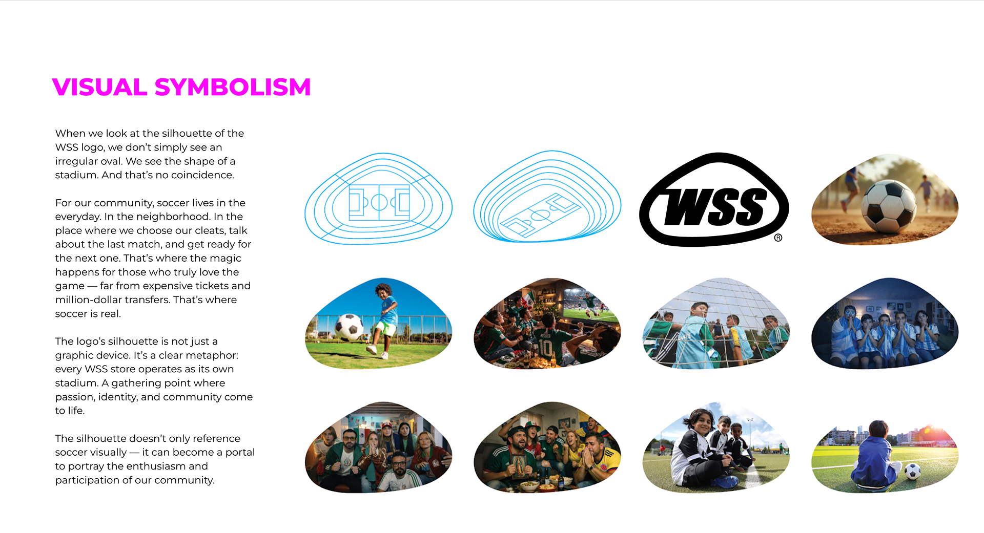
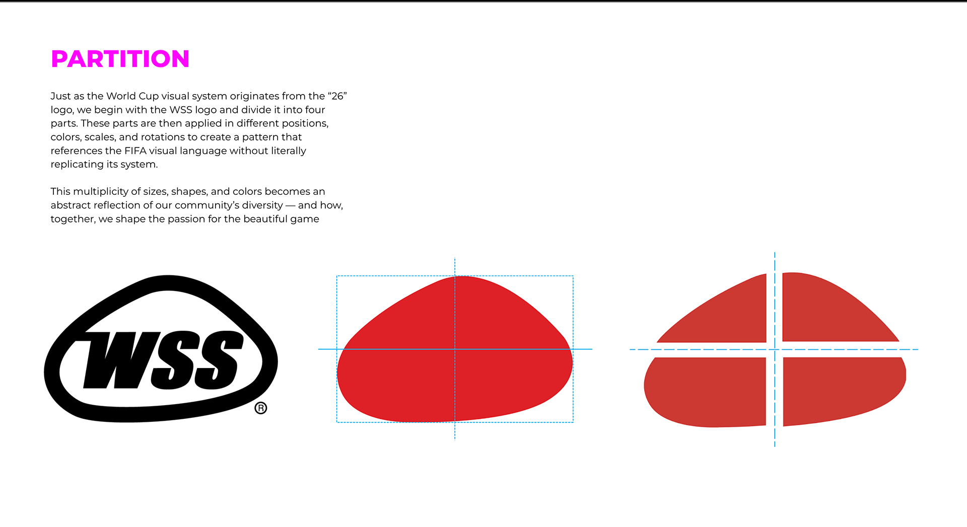
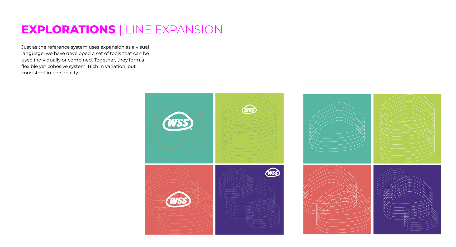
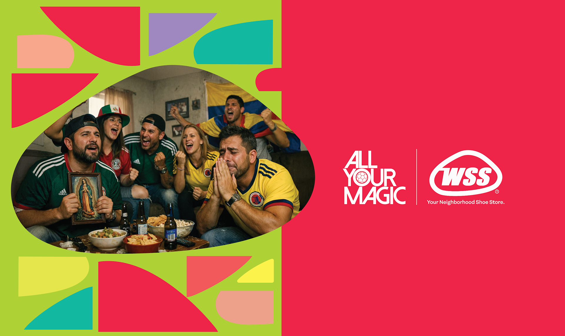
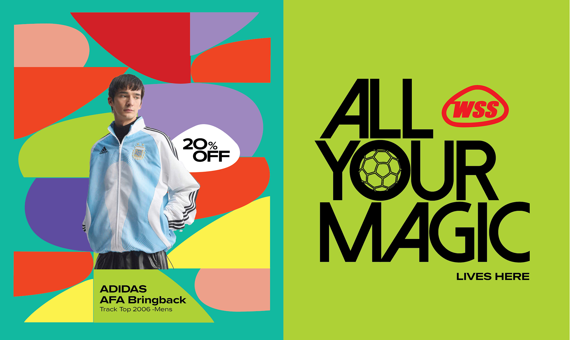
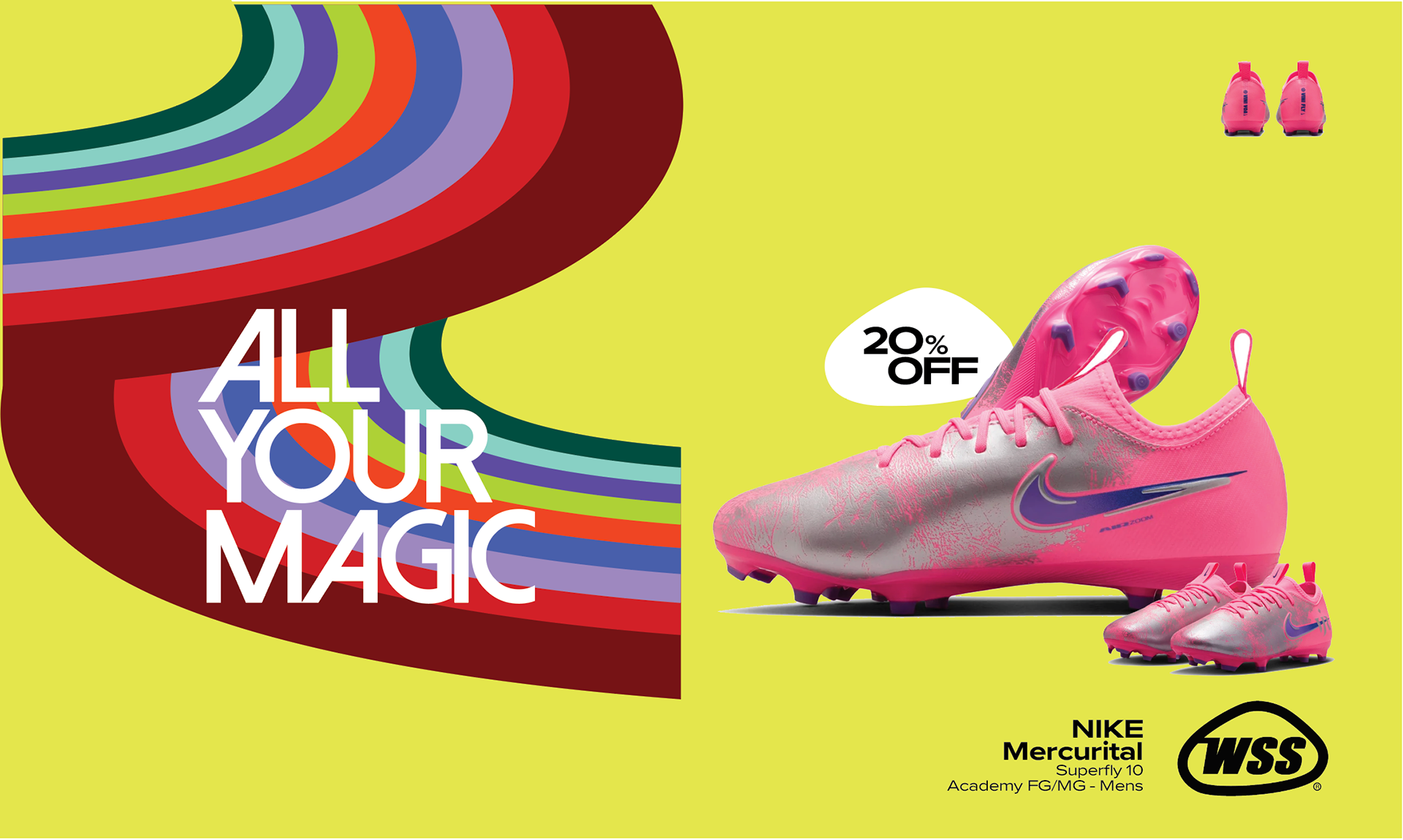
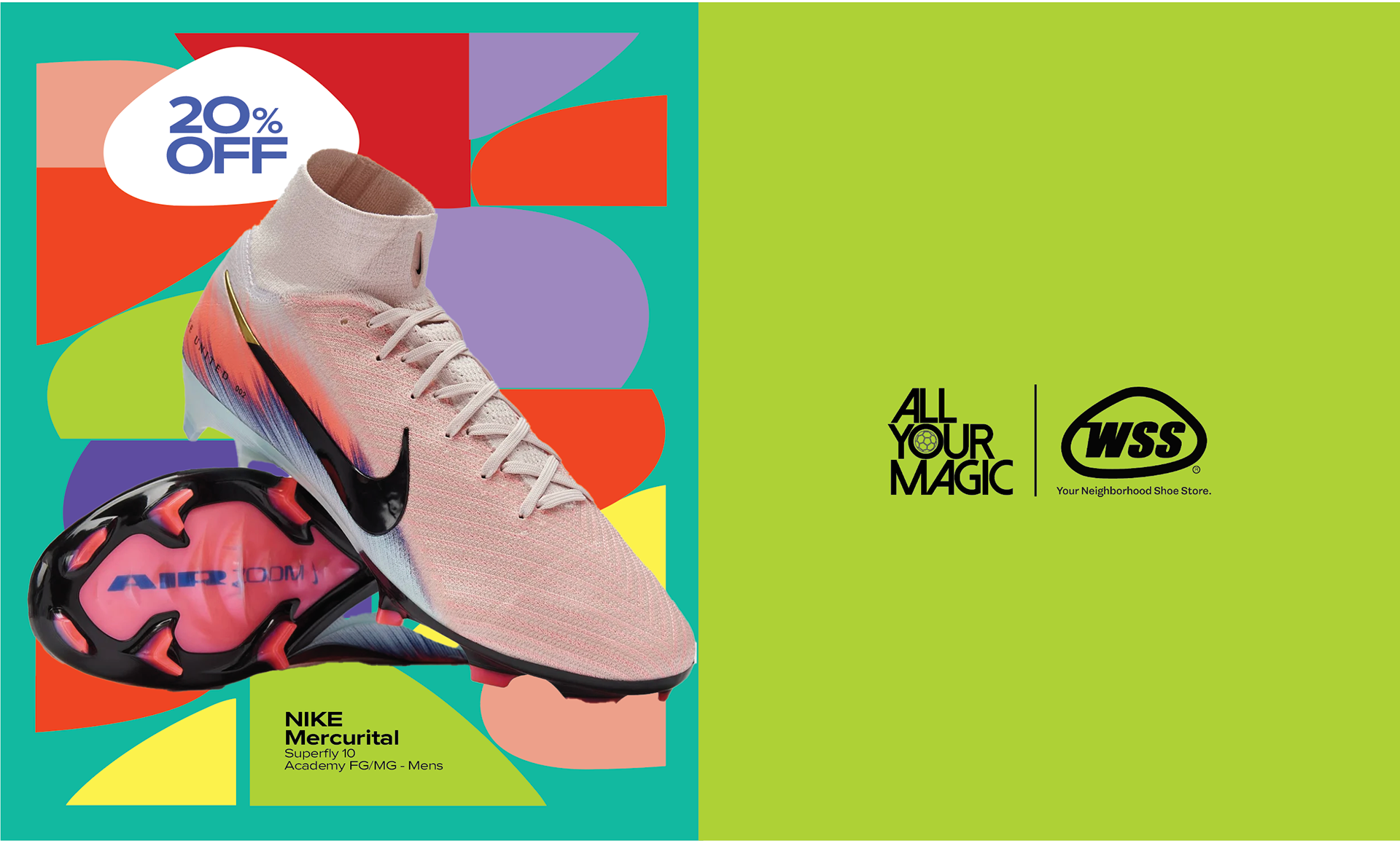
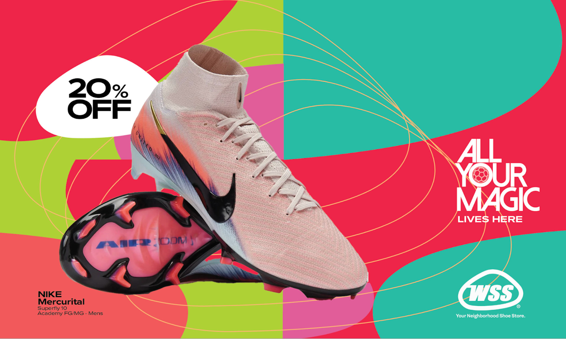
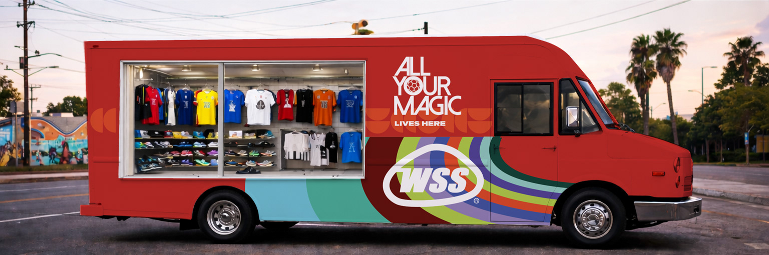
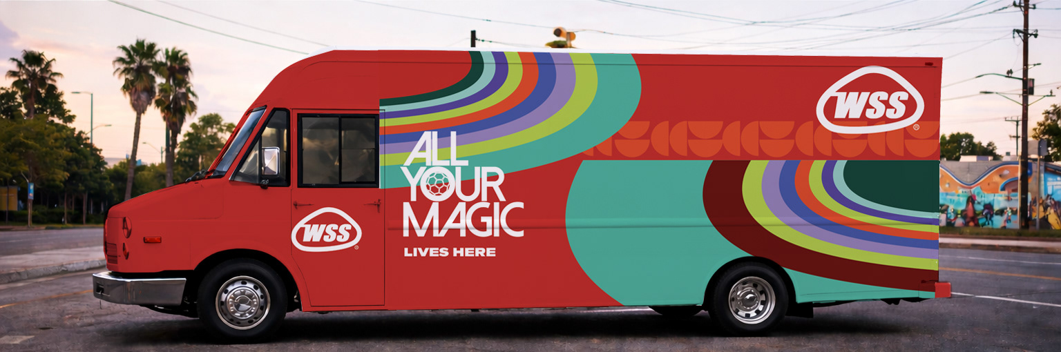
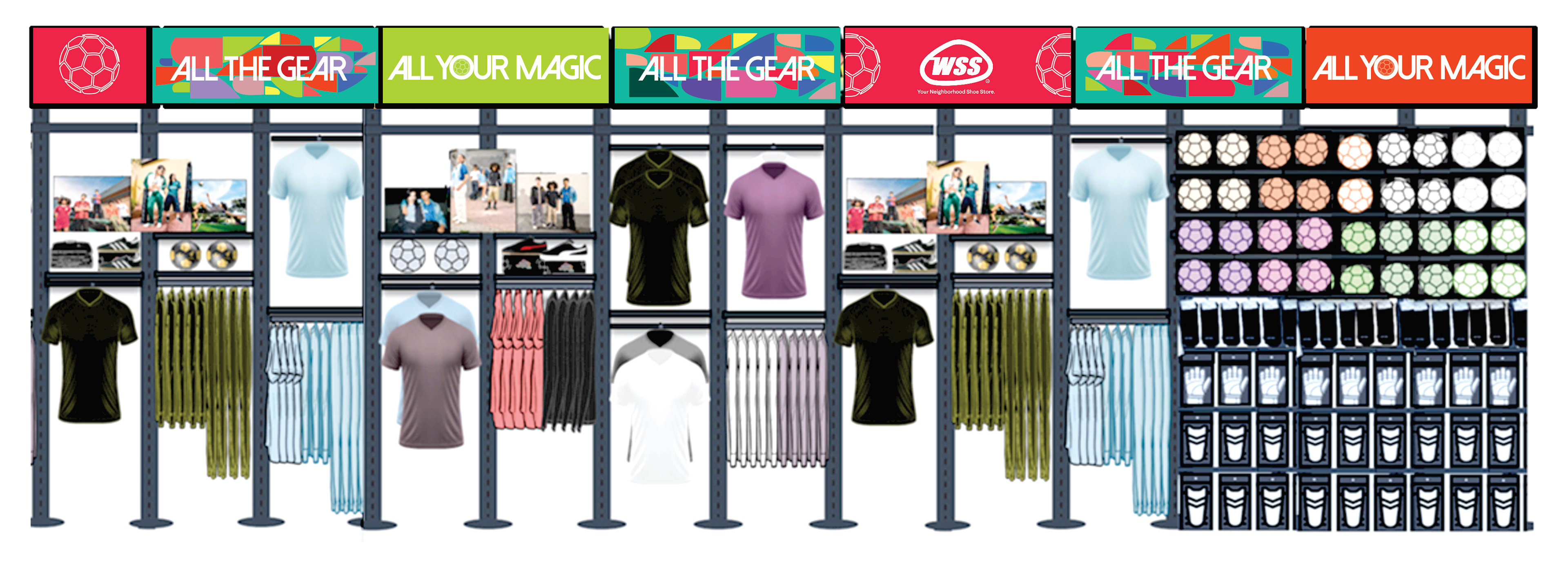
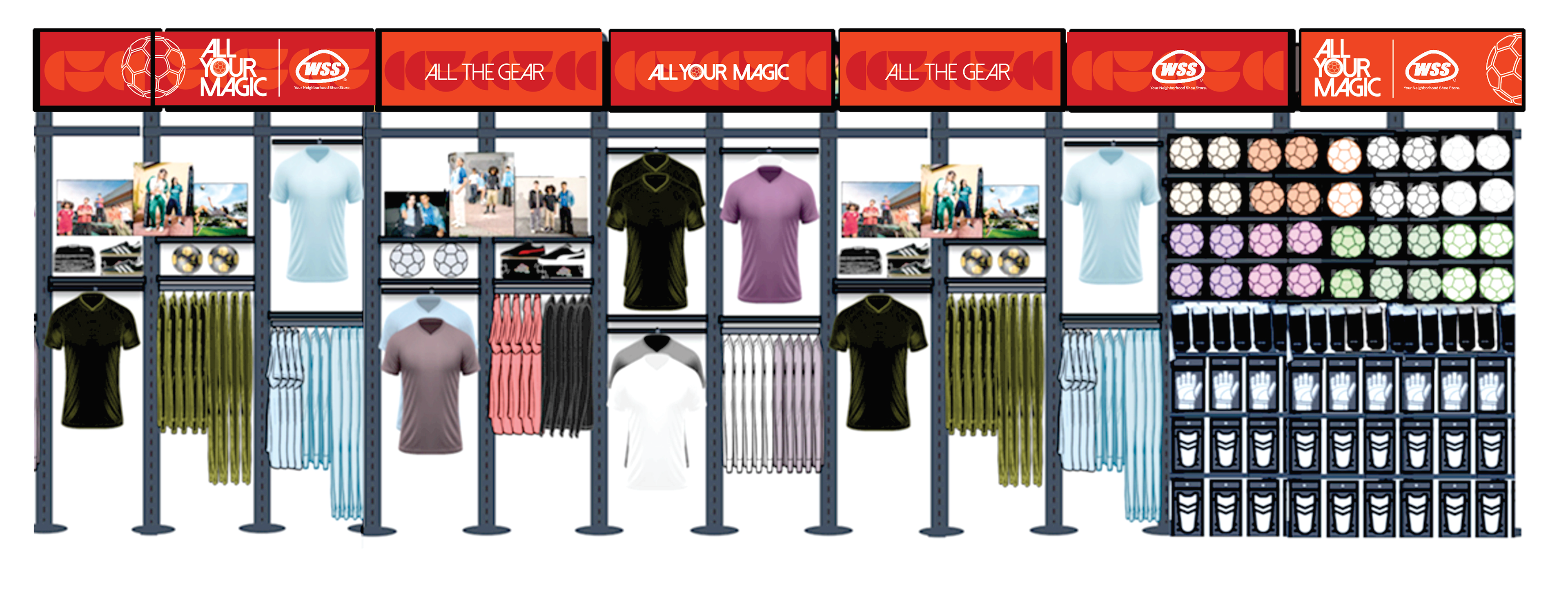
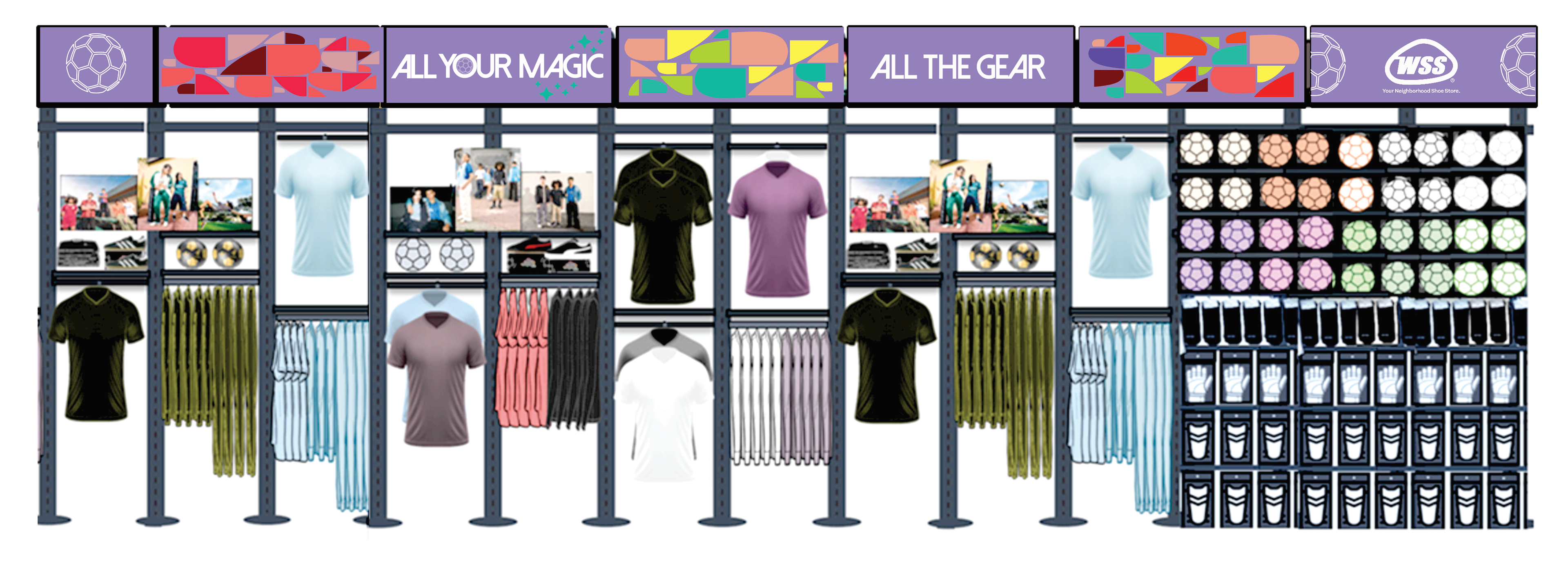
The answer was already in the logo. The oval silhouette of the WSS badge isn't just a graphic device. It's a stadium. Every store is a gathering point. That insight became the conceptual and visual engine of the entire campaign: a design system rooted in the WSS form itself, dividing the badge into parts and applying them at different scales, rotations, and colors to generate a language with the boldness and multiplicity of the moment, without ever referencing what already belonged to someone else.
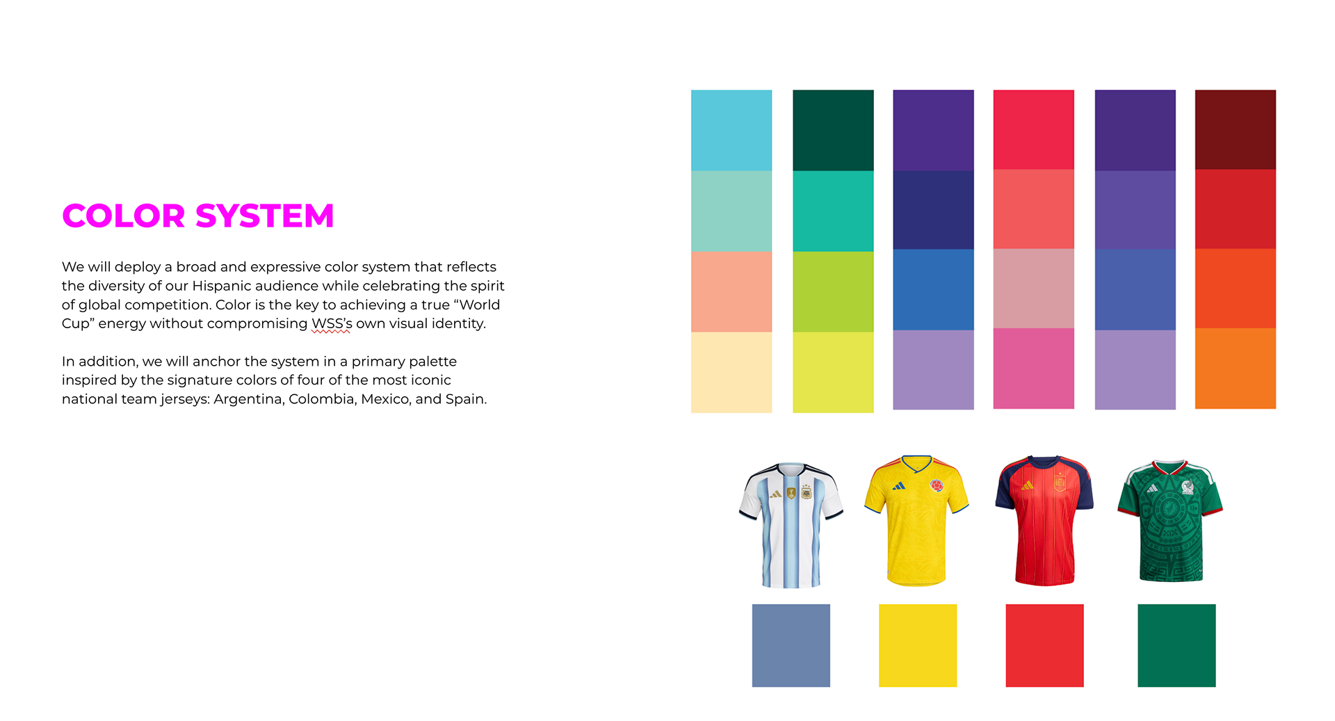
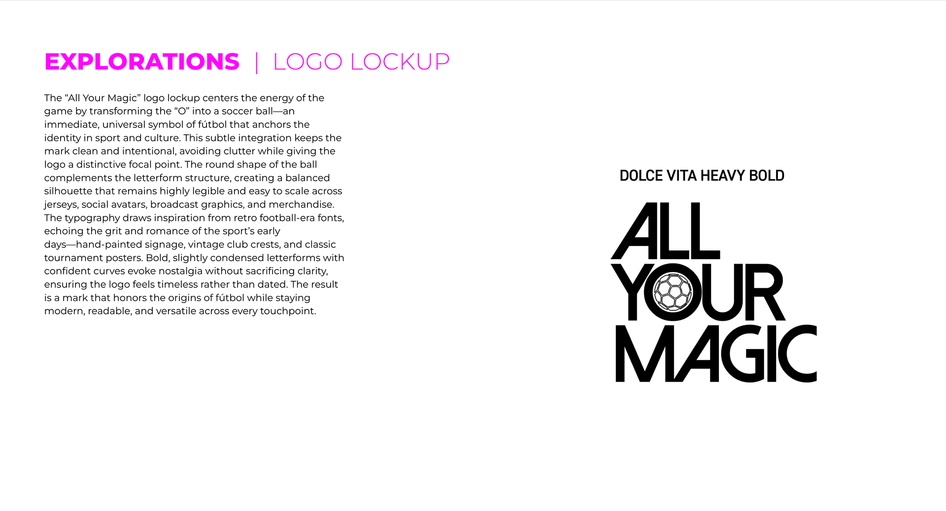
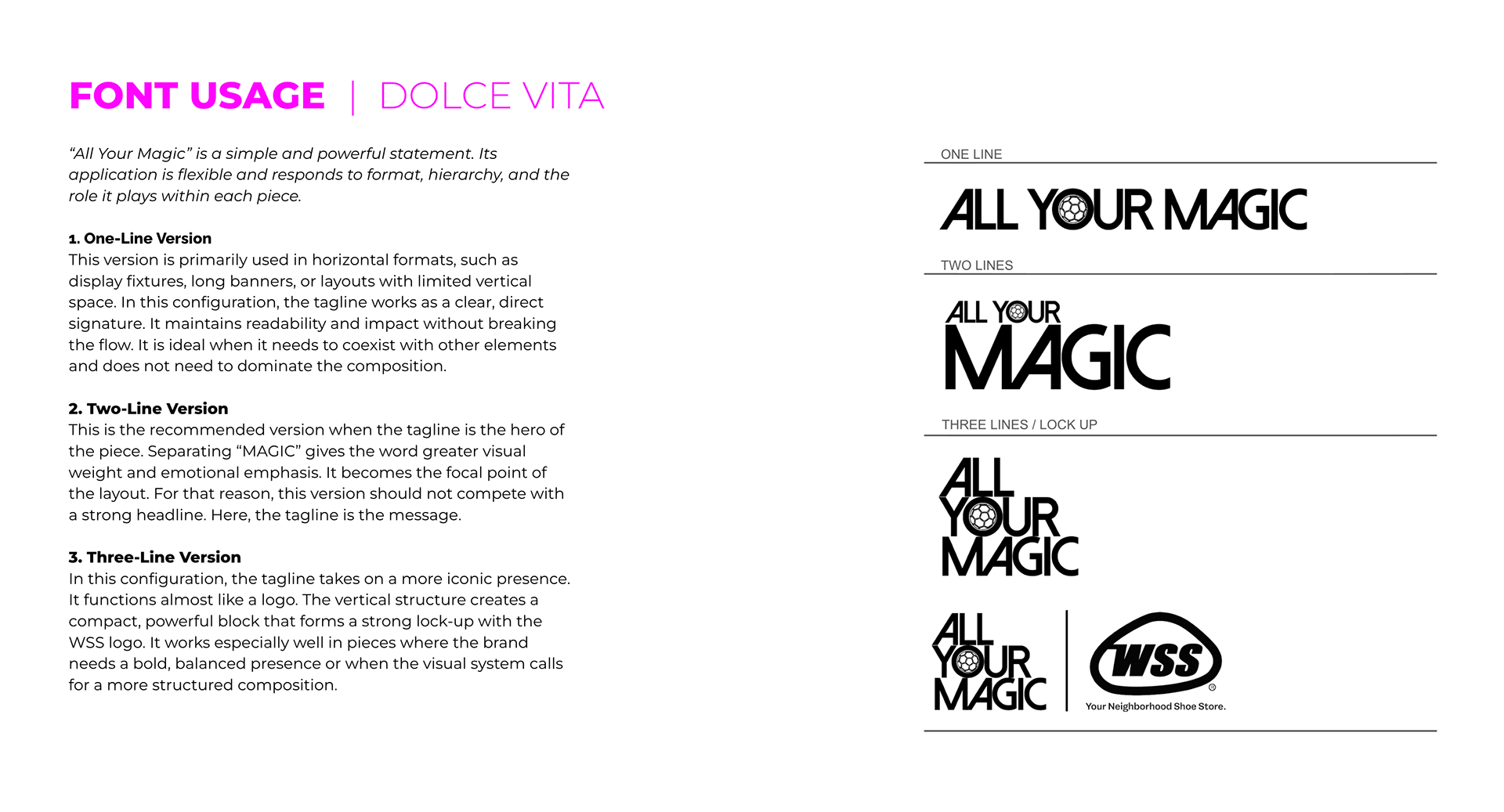
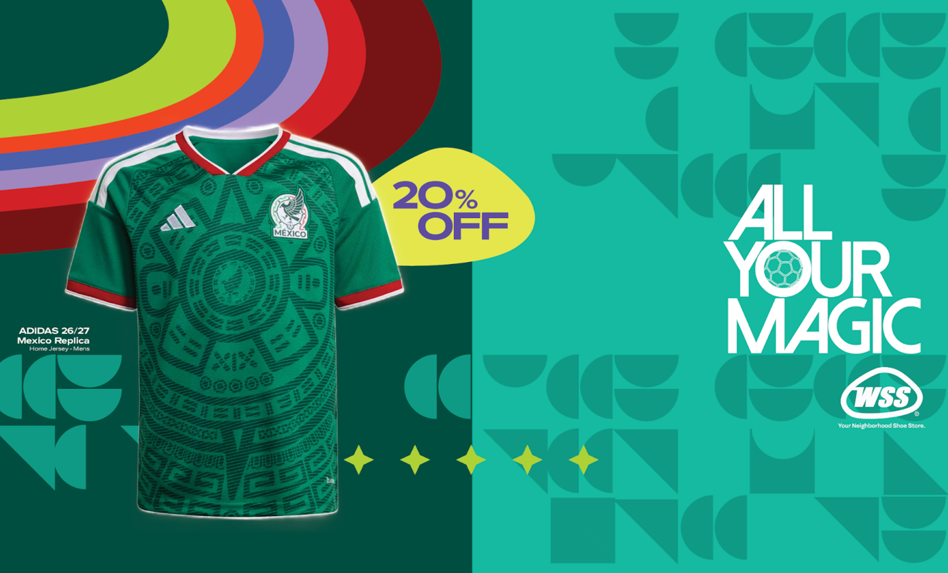
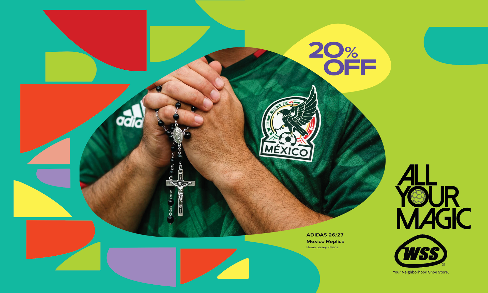
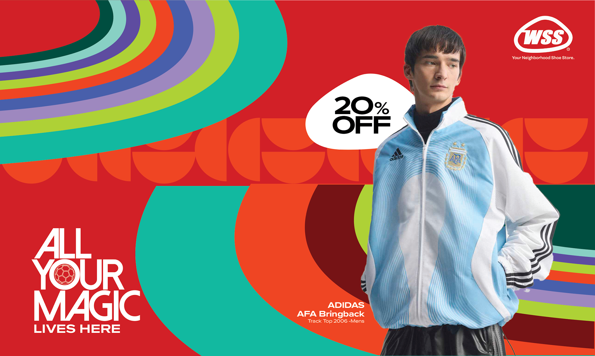
Color came from the four jerseys that live closest to WSS's core audience: Argentina, Colombia, Mexico and Spain. Typography came from two places: the romantic grit of early football signage, and the neon warmth of 70s storefronts where the game was watched on small screens but felt enormous.
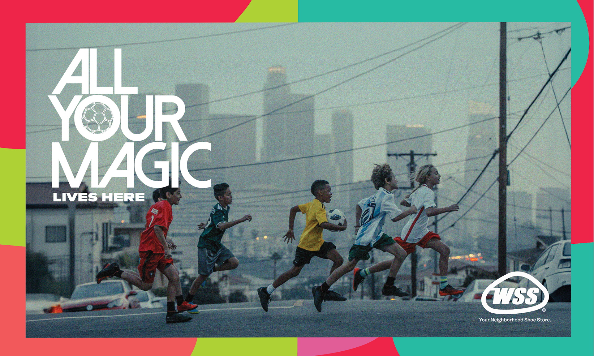
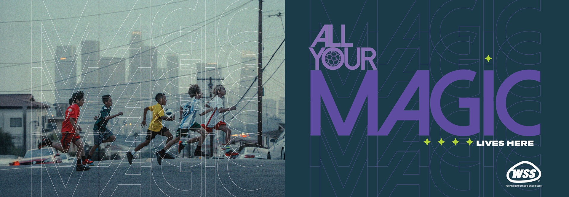
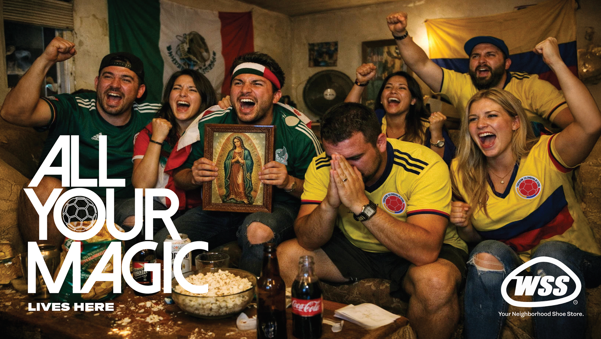
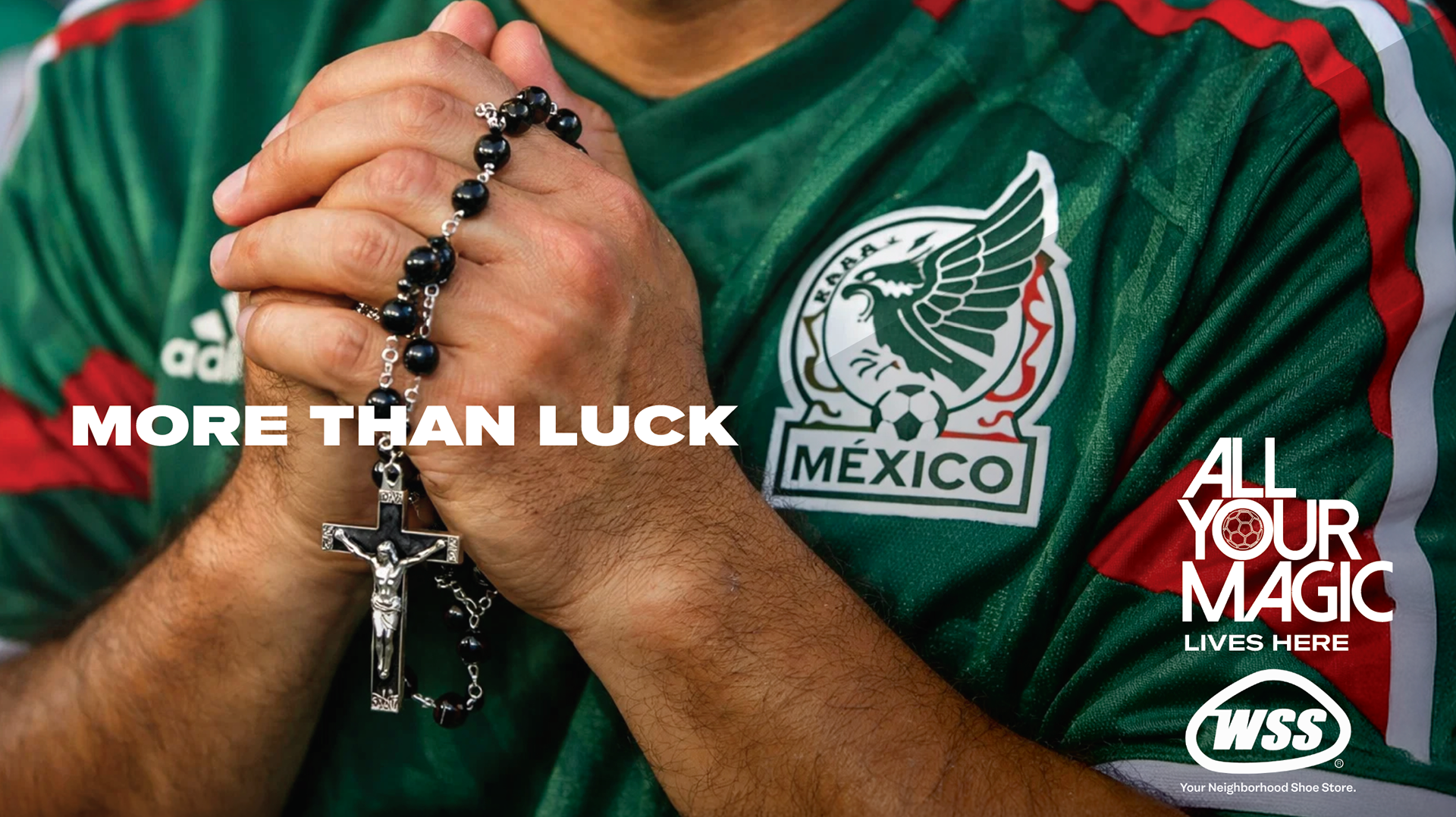
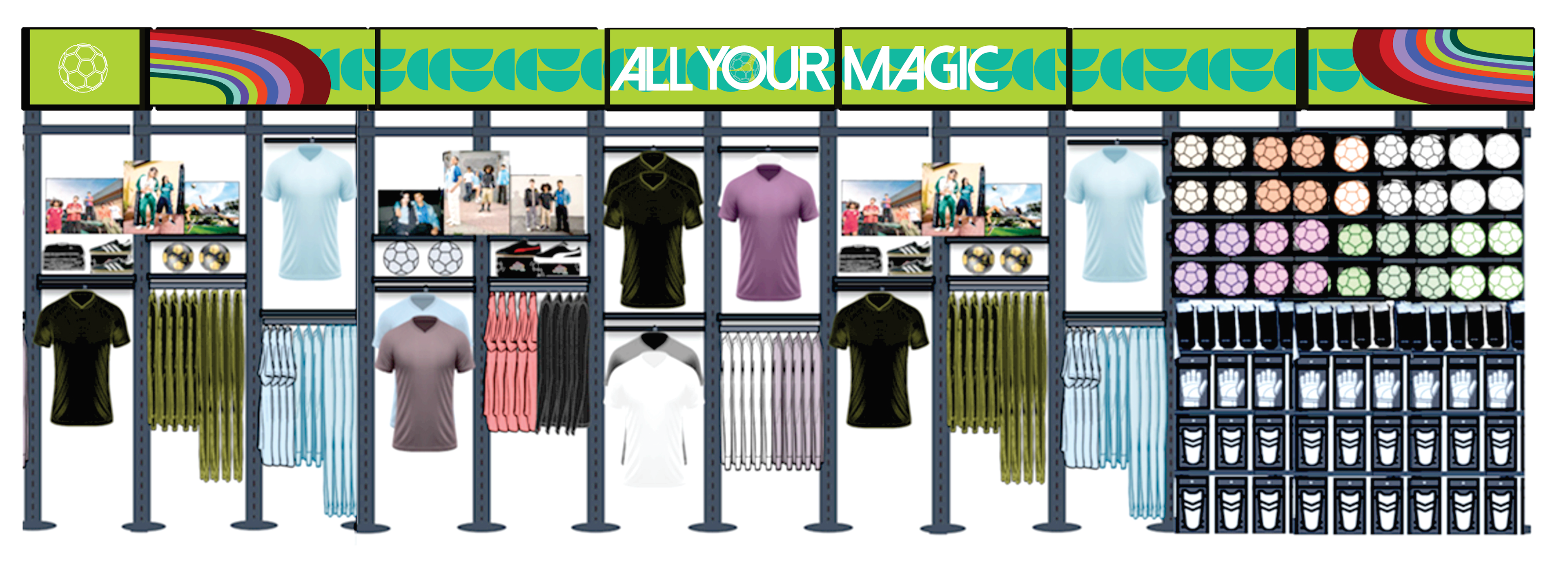
The campaign "All Your Magic Lives Here" scaled from retail posters and print to full in-store Soccer Fan Zone environments, connecting product communication with the cultural rituals that make this sport sacred in Hispanic households. The jersey on the chair. The prayer before kick-off. The whole family packed into one room, half crying, half screaming.
This is where the magic lives. It always has.